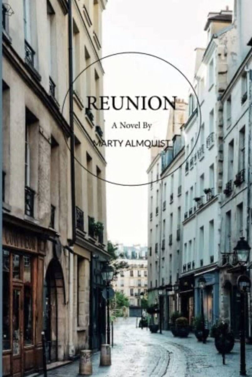
“Reunion” now available on Kindle!

“Reunion” is now available on Kindle, and it took a little longer than expected, but I’ve also learned something about Kindle and how it works. As many of you know, I self-publish my books on Createspace.com, which is a great website and service through Amazon. It’s pretty user-friendly and if you have a wonderful husband who is willing to do the “cut and pasting” required to put your esteemed prose into the Createspace format, creating a paperback version is REALLY easy (thank you, Peter).
We knew that we did not know how to convert the document to a Kindle version ourselves so we hired Createspace to do that. For $79, it’s a bargain. With the first novel, it went very smoothly. We got notification that the “proof” was ready and we reviewed it, and then hit “approve” and “publish” and Ta Da! We were done.
With “Reunion,” it was not quite as easy. We did the first steps and when the proof came, we assumed it would be another quick approval process, but “Reunion” has an added complication. There are journal entries by one of the characters, which are shown in the hard copy in the font “Lucida Handwriting” to mimic her physical writing. It turns out Kindle doesn’t support Lucida Handwriting, so when they did the conversion, the system randomly chose a very light colored, large typeface that did not give a good reading experience AT ALL.
One possible solution presented by the tech staff at Createspace was to take a picture of the journal entries and do a “cut and paste” into the document. Unfortunately, upon further reflection, we realized that this solution has two major issues. First, it would probably put the “cut and paste” section on a different page, which would create a weird reading experience if there were only a couple of sentences on a page and then it moved you to a new page for the journal entry. The other problem is related to the fact that Kindle allows its readers to change the font size. If there were a “cut and pasted” picture of a journal entry, you would not be able to make that adjustment so again, it would create a disruptive reading experience for the user.
So what was left? After more discussion with the Createspace technical team, we decided to make the journal entries italicized.
It then makes it obvious that there is something different going on, and hopefully still gives the reader the emotional experience that I am striving for; the experience of getting to know that character better through her own writing. Do you think it will work? How did that just feel??
I would love to hear from any of you that do get the Kindle version and what you think of the italics as a solution.
And please, if you do enjoy the story, I would love you to “pass it along” to someone you know (and hopefully someone who doesn’t know me) who might also enjoy it. We are headed into beach season and I like to think this would pair well with a cold Stella Artois or a chilled French Chardonnay. Enjoy!!